
Queen Margrethe set off today on the second leg of this year’s annual summer cruise around the islands of her country. Today’s itinerary included visits to Kongsøre Naval Station along with stops at Dragsholm Castle, an children’s educational art program, a manufacturing facility, Algade town center, a nursing care centre, an art museum and a former fish market all located in Odsherred Municipality.
For this busy day of events, Queen Margrethe repeated the red bumper hat she first wore back in May. Today’s better view of this piece show it to be a bumper design with wide cuff brim embellished with stitching around the brim edge and a flat patterned bow at the side. Seeing this hat in full confirmed my initial assessment that while it is not the most exciting of millinery designs, it tops a vibrant and balanced ensemble that looks great on Margrethe. This is one of the times when the whole picture works better than a hat on its own and I particularly like how the streamlined cut of the coat are enlivened by the high contrast pattern on Margrethe’s dress.
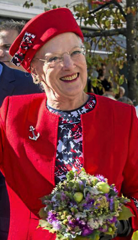


Designer: unknown
Previously Worn: May 24, 2016
What do you think of this hat after getting a full view of it and its accompanying ensemble today?
Photos from Scanpix

That bow on the side is almost as much of a cliche as a navy anchor pin would have been. #pleasecutitoff
The “sailor” style of this hat is certainly appropriate for the occasion, given that the Queen is on a naval ship.
For me the hat is OK, but I like to see this queen wear her small hats at a more pronounced angle (which would show her hair on one side).
I do think she looks better in hats with some width and/or height to balance her proportions, as she is fairly tall.
Because she has a very high forehead, grey hair, and a pulled back hairdo, she does look rather bald. I think if had smaller hats, or wore them placed a little further back on her head, and “puffed up” her hair, rather like her sister, it might be a better or more balanced look.
I agree with what Donna says: September 5, 2016 at 5:11 pm. These styles of hats she wears tend to make her look bald. I prefer her in brimmed hats.
I think she looks overall relaxed and wonderful. Cheery colours and lots of smiles.
indeed Dianne
As an overall outfit I really like it. I love the plain red coat and hat with the pattern of the dress. I would agree with the comments that a front on view makes her look bald but that is not an assessment of the outfit. I would also agree that she could lose the bow on the hat. It is a little too cutesy for her age.
I agree with what Michell says: September 5, 2016 at 1:40 pm. That little bow to match the dress is just too twee!
The entire ensemble works really well, although I’m not “sold” on the hat.
In that charming picture, I first thought Queen Margrethe was reading to the children, but then noticed the pen or pencil in her hand and having watched that documentary about her artistic talents, was wondering if she is drawing a picture.
Funny this is still billed as a summer cruise when it’s fall now. I don’t care for the matching fabric bow on the hat that matches exactly to her dress – coordinating is fine – but matching is too old school for me and I’m in my late 70s!
Autumn does not ‘officially’ start for three more weeks!
The only thing I don’t like about this hat is that from the front, full on, it has the unhappy effect, for me, of making the queen look rather bald. I agree with you, HatQueen, that looking at the hat from different angles and in the context of the entire ensemble, shows that the hat otherwise works really well. And it is a lovely color. (I love the photo of the queen reading to the children.)
I’ve never liked how matchy-matchy she is by incorporating the patterned fabric of her dresses onto her hats. So, I’m still of the same mind as last time that the bow should be a solid color (red, white, or navy) rather than be patterned; then this hat could work well with other outfits (I’m all about versatility with one’s wardrobe).
Perhaps it wouldn’t be difficult to change the bow with one of another color for use with other ensembles?
Good call. And while we’re making modifications… I think I’d like this one better in straw to give it some texture.
This look is perfect for this time of year and leaves me feeling cheerful and smiling!